
Scott Servante
AS Media
Double Page Spread Constructions:
To begin with I placed my photo into the layout and drew two lines at both the bottom and top part of the page. I used the line tool to do this and to ensure that my lines were straight I held control when drawing the lines, as it makes them perfectly straight. I also thickened the top one as according to my plan.


Next I needed to add some page numbers to my pages and the date to the bottom part of the page. I did this using the text tool. You may notice that I have put the name of my magazine in front of the page numbers. I have done this on purpose as my research showed me that this is normally done in music magazines. I have
done this on purpose as my research showed me that this is normally done in music magazines. Next to the page numbers I added some page furniture: a rewind and fast foward button. I did this to help make the page look that little bit better. It also ties in with music aswell! I have also added a purple line above the black one at the top of the page. I have done this to help maintain a consistent house style. Finally you may notice that my image is slighly lighter. This is becuase I adjusted it in photoshop to make the photograph stand out better. It was just too dark before.


Adjusting the brightness of my image was simple. First i opened up the image in photoshop. Then I went to image - adjustments - 'Brightness/Contrast.' Once here a little pop-up screen came up for adjusting the brightness and contrast. From there I was able to adjust the brightness according. In this case I wanted to increase the brightness as my image was too dark. i settled around +45 for the brightness in the end.
This next part was very simple. I added a bubble to put some text in, in the top right corner. To do this I went to tools - shapes - then selected the rectangle tool. But i wanted rounded edges. To do this I had to go to a little drop down menu at the top of indesign. There I could choose what edges I wanted. To get the bubble the way it is I simply layered two different colored bubbles on top od each other.


The next part was simple again. I simply created a text box and then pasted my text into it. Once the box was full up I simply selected the little red + button at the bottom of the text box to create a continued texted box that could be placed. The i simply messed around with the font, added a pull quote and changed the colour od my questions that I answer in the interview. A 'drops cap' was also added to start off the article, using the 'paragraph' box.


For the next part I added an introductory title to my double page spread. I made the text very large so that it is the first thing that you notice when you arrive at the page. I have used a different font for this and I also have underlined it. Finally I decided that i wanted the reader to be attracted to the words 'DJING FOREVER' so I change the colour of it to make it stand out.

Lastly, some small bits were added. I added some text into the bubble that I created previously and I also added some small text on the image about who took the photograph.
Finished Result:

Double Page Spread Constructions 2:


I decided that I wanted to make an album cover to place on my second double page spread so I will show you how I made it in this section and the section below.
To start off I had to find an image to use for the album cover. After searching through my photographs I noticed this pictiure (left). I liked the eyes and thought that I could do something nice with them. I thought that I could possibly use the eyes or one of the eyes as an image for the album cover. So I started by cropping the image so that I just had the eyes.


Once I cropped the image I placed it into my templatye file that I created. However once it was inside it was not big enough, so I had to go to Edit - Free Transform to resize the image, so that I could just have the eye showing (right image).


I then went to Image-Adjustments - Curves to change the image slightly. I wanted a darker faded version for the cover.

I then decided that I wanted some sort of overlay over my image. I decided on a neon paint splatter image that I found. I thought it would look nice if it was placed over the image of the eye. To do this I place the image of the paint behind the image of the eye and then decreased the opacity of the image of the eye until I found a suitable fit. I settled on an opacity of 63% in the end.


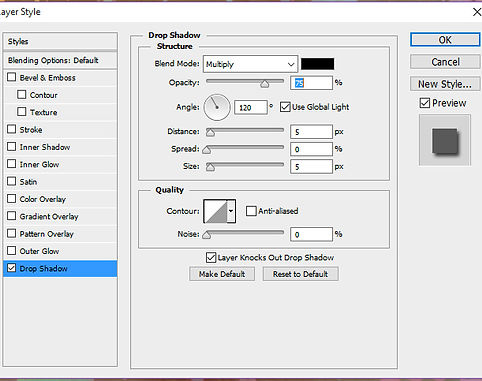
Next I added some text using the text tool but i realised that it looked a bit too flat. So to counter this, I added a drop shadow. Then the album cover was complete!
I started with the foundations that I used for the other page. All I had to do was to change the page numbers.


I then added the text.
The image and album cover were then added to the right hand side. I decided that I was going to place the album cover in the corner of the image.
Finally I added a rounded rectangle in the little space underneath the article for a 'Did you know?' section. I also added text inside this box and then also added some text illustrating who the photograp was taken by.


The rectangular box was made using the rectangle tool and then I made the edges curved using the drop down menu.

Finished Result:
